Introduction
A beautiful blessing can brighten someone’s day, offer comfort, or remind them that they are loved. However, plain text often lacks the visual appeal needed to capture attention on social media or messaging apps. With an image text editor, you can turn meaningful words into attractive images that people will want to save and share. From morning prayers to birthday wishes and inspirational quotes, the right combination of text, colors, and backgrounds can make every blessing feel more personal and memorable.
What Makes a Blessing Image Beautiful and Shareable?
A beautiful blessing image combines meaningful words with a clear and appealing design. It should communicate a positive message within seconds while creating an emotional connection with the reader.
People often share blessings to express gratitude, encourage friends, celebrate special moments, or offer spiritual support. A well-designed image makes these messages easier to understand and more enjoyable to receive.
Three elements play an important role in creating an effective blessing image: the message, the background, and the text layout.
The message should feel genuine and easy to read. The background should support the emotion behind the words, while the layout should guide the reader’s attention toward the blessing itself.
For example, a morning blessing might feature a peaceful sunrise with the words, “May your day begin with hope and end with happiness.” A sympathy blessing may use soft colors and a simple background to create a calm, respectful feeling.
You can also explore different types of blessings at Quick Blessing to find inspiration for messages suited to everyday moments and special occasions.
Key Takeaway: Shareable blessing images combine heartfelt messages, suitable backgrounds, and readable text to create a strong emotional connection.
How Can You Choose the Right Blessing Message?
The first step in creating a blessing image is selecting words that match the occasion and the person receiving them. A short, thoughtful message often works better than a long paragraph because readers can understand it quickly.
Start by identifying the purpose of the blessing. Are you wishing someone a peaceful morning, celebrating their birthday, or offering encouragement during a difficult time?
Once you know the purpose, choose language that feels warm, sincere, and appropriate. Avoid complicated phrases that might confuse the reader. Simple words often create the strongest impact because they sound natural and personal.
Here are a few examples of blessings for different occasions:
| Occasion | Example blessing |
| Good morning | May your morning bring peace, joy, and fresh opportunities. |
| Birthday | May your new year of life overflow with love and beautiful memories. |
| Good night | May your heart rest peacefully and tomorrow bring renewed hope. |
| Friendship | May your life always be surrounded by kindness and true friends. |
| Encouragement | May you find strength in every challenge and hope in every new beginning. |
You can personalize these examples by adding a recipient’s name or referring to something meaningful in their life. This small adjustment can make an ordinary greeting feel more special.
Before moving to the design stage, read the blessing aloud. If it sounds natural and communicates one clear idea, it is likely suitable for an image.
Key Takeaway: Choose short, meaningful blessings that match the occasion and express one clear emotion or positive wish.
How Do You Use an Image Text Editor to Create Blessing Images?
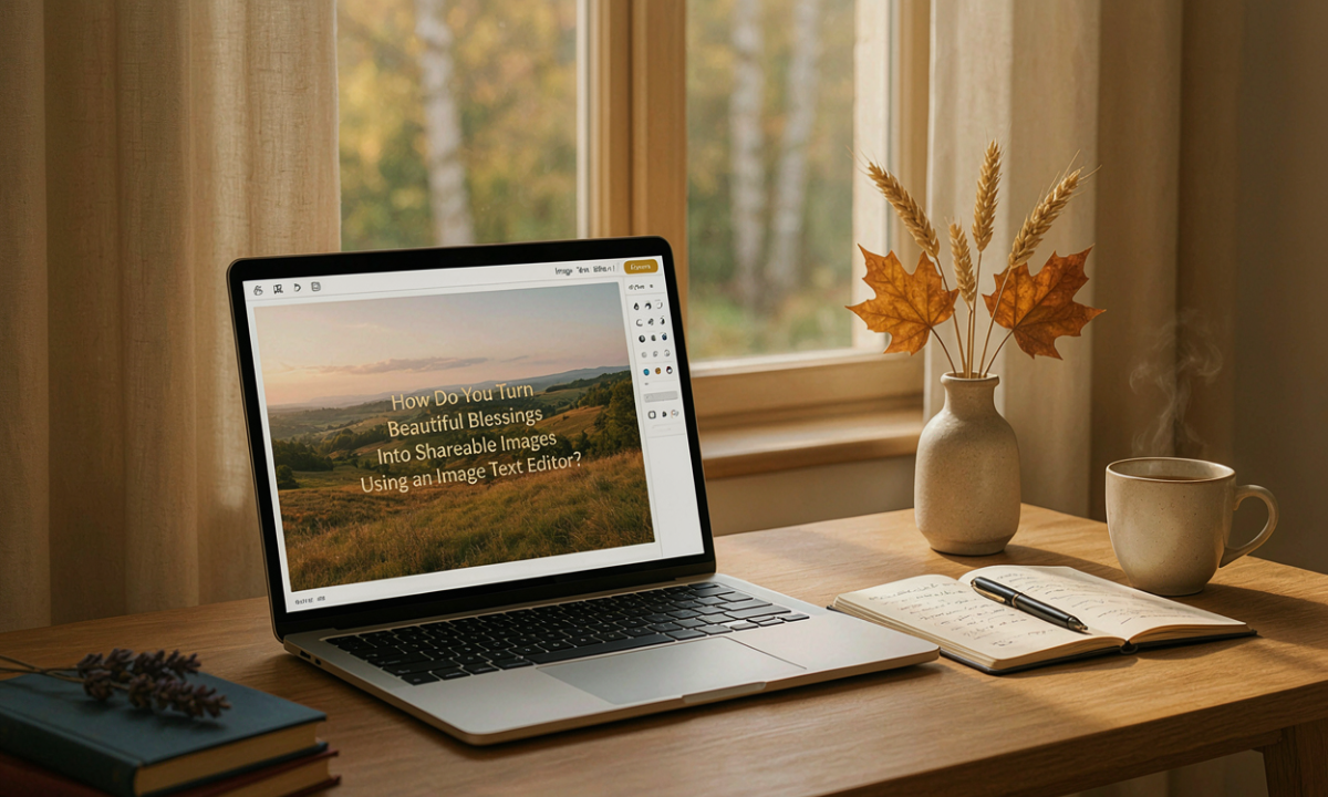
An image text editor allows you to place written messages on photographs, illustrations, or graphic backgrounds. Most editors provide basic tools for changing fonts, adjusting text size, selecting colors, and positioning words.
The process does not require advanced design knowledge. With a few simple steps, you can create an image that looks organized and communicates your blessing clearly.
Step 1: Select a Suitable Background
Choose a background that reflects the mood of your message. Nature photographs, flowers, sunrise scenes, peaceful skies, and simple patterns work well for many blessing images.
Avoid backgrounds with too many details because they can make the text difficult to read. If the photograph looks busy, consider adding a soft transparent overlay behind the words.
For example, a gratitude blessing may look beautiful against a warm sunset, while a peaceful night message may work better with a dark blue sky.
Step 2: Add Your Blessing Text
After choosing the background, insert your message into the editor.
Keep the main blessing short enough to fit comfortably within the image. Break longer sentences into two or three lines to improve readability.
For example:
“May your heart be filled with peace, your home with happiness, and your days with endless blessings.”
This layout is easier to read than placing the entire sentence on one crowded line.
Step 3: Choose an Easy-to-Read Font
Fonts influence how people experience your message. Decorative script fonts can create an elegant appearance, but complicated lettering may reduce readability.
For most blessing images, choose a clear serif or sans-serif font. You can use a decorative font for a short heading and a simpler font for the main message.
Limit your design to one or two font styles. Too many different fonts can make the image look inconsistent.
Step 4: Adjust Colors and Text Position
Select text colors that contrast with the background. Dark lettering works well on light images, while white or cream text often looks good on darker backgrounds.
Place the text where it does not cover important parts of the photograph. Centered text works well for short blessings, while left-aligned text can help readers follow longer messages.
Step 5: Preview and Save Your Design
Before saving, check the image at a smaller size to see how it might appear on a phone screen.
Look for spelling errors, uneven spacing, and text that blends into the background. Once everything looks clear, export the image as a PNG or JPEG file.
Key Takeaway: Create blessing images by choosing a suitable background, adding meaningful text, adjusting typography, and checking readability before saving.
Which Colors, Fonts, and Backgrounds Work Best for Blessing Images?
Colors and typography can change the feeling of a blessing image even when the message stays the same.
Soft pastel shades often create a peaceful mood. Gold and warm yellow can suggest gratitude or celebration, while blue and green may help create a calm atmosphere. However, personal taste and cultural context also influence how people interpret colors.
The most important factor is consistency. Your chosen colors should support the message rather than compete with it.
For example, a birthday blessing can feature cheerful colors and flowers, while a prayer image may benefit from a simpler background and softer tones.
Readability matters just as much as appearance. The Web Content Accessibility Guidelines from W3C recommend a contrast ratio of at least 4.5:1 for normal-sized text in standard accessibility situations.
Although blessing graphics are not always designed as web interface elements, this guideline offers a useful reference for creating readable text.
Try to leave enough empty space around the message. Designers call this negative space, which means the unused area surrounding text or visual elements.
Negative space helps the reader focus on the blessing without distractions.
Key Takeaway: Use harmonious colors, simple fonts, strong contrast, and enough empty space to make blessing images attractive and easy to read.
How Can You Make Blessing Images More Personal and Meaningful?
Personalization can transform a general blessing into a thoughtful message that feels created for one person.
You can personalize an image by adding a name, including an important date, choosing a favorite color, or using a photograph connected to a shared memory.
For example, instead of writing “Happy Birthday,” you could write, “May this birthday bring you new reasons to smile, Sarah.”
Another option is to match the visual style to the recipient’s personality. Someone who enjoys nature may appreciate a forest or mountain background, while someone who loves flowers may prefer a floral design.
For spiritual messages, consider the recipient’s beliefs before adding religious imagery or references. A general blessing may be more suitable for someone whose traditions you do not know.
Also, make sure any scripture or quotation is accurate and properly attributed. If you write an original blessing, you can keep the message simple without adding an attribution.
Key Takeaway: Add names, meaningful details, and thoughtful visual choices to make blessing images feel personal without overwhelming the design.
What Image Sizes Work Best for Sharing Blessings Online?
Choosing the right image size helps your blessing appear correctly across social media platforms and messaging apps.
Different platforms use different display formats, so a design that looks good in one place might appear cropped somewhere else.
Common starting dimensions include:
| Sharing format | Suggested dimensions | Typical use |
| Square | 1080 × 1080 pixels | Social feeds and general sharing |
| Portrait | 1080 × 1350 pixels | Vertical feed posts |
| Story | 1080 × 1920 pixels | Stories and full-screen mobile graphics |
| Landscape | 1200 × 630 pixels | Link previews and wide graphics |
These are practical design sizes rather than guaranteed requirements. Platform specifications and cropping behavior may change.
Keep important text away from the edges, especially when designing vertical images. Some apps place interface elements over the top or bottom of the picture.
For image quality, PNG can preserve crisp text and simple graphics, while JPEG is often suitable for photographs with smooth color changes.
If the image contains important text, consider including the same blessing in the post caption so people using screen readers can access the message.
Key Takeaway: Match the image dimensions to the sharing format, leave safe margins, and keep the blessing readable on mobile devices.
What Common Mistakes Should You Avoid When Designing Blessing Images?
Even a meaningful blessing can lose its impact when the design becomes difficult to read or visually crowded.
One common mistake is placing too much text on a single image. Long paragraphs force readers to spend extra time understanding the message, especially on smaller screens.
Another mistake is choosing colors that blend into the background. Light yellow text on a white sky, for example, may look gentle but can be difficult to read.
Overusing decorative elements can also distract from the blessing. Multiple font styles, stickers, borders, and bright effects may compete for attention.
Instead, focus on a clean design that supports the message.
Check these details before sharing:
- Keep the main blessing short and focused.
- Use no more than two font families.
- Maintain strong contrast between text and background.
- Avoid placing important words near image edges.
- Check spelling, punctuation, and alignment.
- Use photographs or illustrations you have permission to share.
- Review the final design on a mobile screen.
The U.S. Copyright Office’s copyright basics guide explains how copyright protects original creative works. Using your own images, properly licensed visuals, or public-domain material can help you avoid unnecessary copyright concerns.
A simple, thoughtful design usually communicates more effectively than an image filled with decoration.
Key Takeaway: Avoid crowded layouts, weak text contrast, excessive decoration, and unlicensed images to create polished blessing graphics.
How Can You Make Blessing Images Worth Saving and Sharing?
People are more likely to share a blessing when it feels relevant, meaningful, and easy to understand.
Start by thinking about the moment in which someone might receive the image. A good morning blessing can offer encouragement at the start of the day, while a weekend blessing may focus on rest, happiness, and time with loved ones.
Seasonal messages can also make your images more relevant. Thanksgiving blessings may express gratitude, while New Year blessings often focus on hope and fresh beginnings.
However, relevance alone is not enough. The message should feel genuine rather than generic or overly dramatic.
Creating a consistent visual style can also help. You might use a familiar set of colors, similar typography, and a balanced layout across different blessing categories.
When sharing, add a short caption that complements the image rather than simply repeating it. For example, a peaceful morning blessing could appear with the caption, “Sending a little encouragement to everyone starting a new day.”
You can also invite thoughtful interaction with a natural question, such as “Who would appreciate this message today?”
Avoid asking people to share repeatedly. A sincere message should provide value on its own.
Key Takeaway: Make blessing images easy to save and share by focusing on emotional relevance, clear design, and thoughtful captions.
Frequently Asked Questions
1. Can I Create Beautiful Blessing Images Without Design Experience?
Yes. You can create attractive blessing images with basic editing tools, ready-made backgrounds, and simple fonts. Start with one short message and a clean layout rather than adding complicated effects.
Quick Answer: Basic text editing tools and a simple layout are enough to create appealing blessing images.
2. What Is the Best Background for a Blessing Image?
The best background depends on the message. Sunrises, flowers, nature scenes, and soft color gradients are versatile choices. Select an image that supports the emotional tone and leaves enough room for readable text.
Quick Answer: Choose a calm, relevant background that complements the blessing without distracting from its words.
3. How Much Text Should I Add to a Blessing Image?
A short blessing of one to three sentences is often a good starting point. The ideal length depends on the image size, font, and platform. Prioritize readability over fitting more words into the design.
Quick Answer: Use a short, focused message that readers can understand quickly on a mobile screen.
4. Can I Share Blessing Images on WhatsApp and Social Media?
Yes. You can share blessing images through messaging apps and social platforms when you have the rights to use their visual content. Save your design in a common image format and check how it appears before posting.
Quick Answer: Blessing images can be shared across common platforms when the format is suitable and the content is used lawfully.
5. How Do I Make Text Easier to Read on a Photo?
Use a clear font, increase the text size, and choose a color that contrasts with the background. If necessary, add a subtle dark or light overlay behind the text.
Quick Answer: Clear fonts, strong contrast, and simple overlays improve text readability on photographic backgrounds.
Conclusion
Turning beautiful blessings into shareable images is a simple way to make thoughtful words more engaging and memorable. The process begins with a meaningful message and continues with a suitable background, readable typography, and a balanced layout.
An image text editor helps bring these elements together without requiring advanced design skills. Whether you are preparing morning greetings, birthday blessings, prayers, or encouraging messages, focus on creating something that feels sincere and easy to understand.
The best blessing images do not need elaborate designs. They need words that matter, visuals that support the message, and a format that makes sharing effortless.
Final Takeaway: Create meaningful and shareable blessing images by combining heartfelt words, readable text, suitable visuals, and mobile-friendly formatting. Prioritizing clarity, accessibility, and genuine value helps your content serve readers while supporting natural search visibility.